Graphs as Art
If done well a graph representation of data can reveal a lot of information about the structure of the data. And with particular care graphs can even become art.
Sala has achieved this by building a very nice graph representation applet for web pages. If you visit this posting you’ll see some really cool graph representations. The boing-boing one is particularly telling.
There are now about 1700 webpage graphs posted on flickr, tagged with websitesasgraphs. Go graph your own webpage here. Source code is also available.
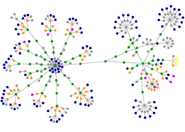
Below is the graph for the All Thing Distributed home page. On the left are the postings, on the right the sidebar with categories, archives, etc.
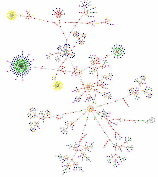
This one is for the Amazon.com gateway page. There are two distinct cluster of forms (yellow) and I am assuming that the big link cluster (green/blue) on the left is the navigation bar,
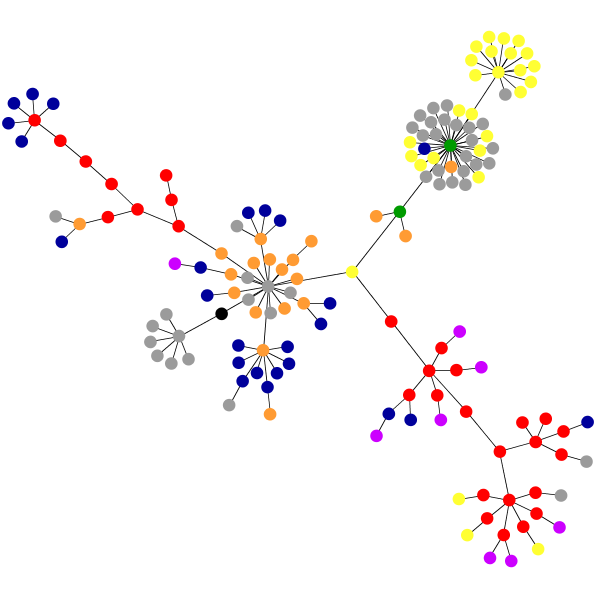
A9’s landing page is rather different. I think that the yellow in the top left are the columns you can select.
[via Anil Dash]